A more modern brand look and feel for the Post Office.
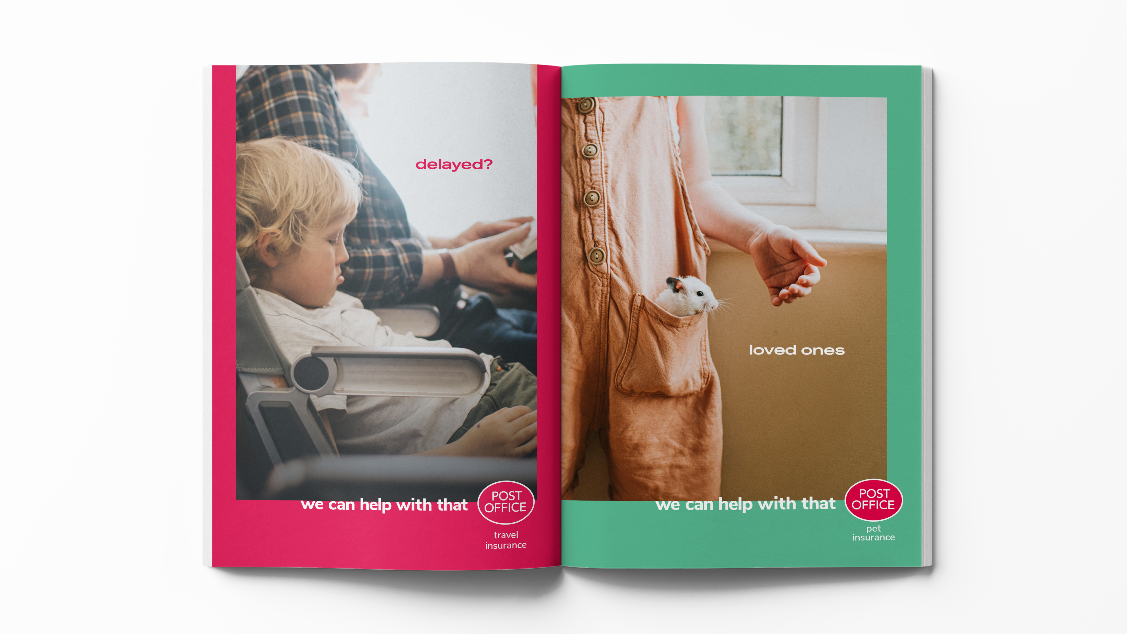
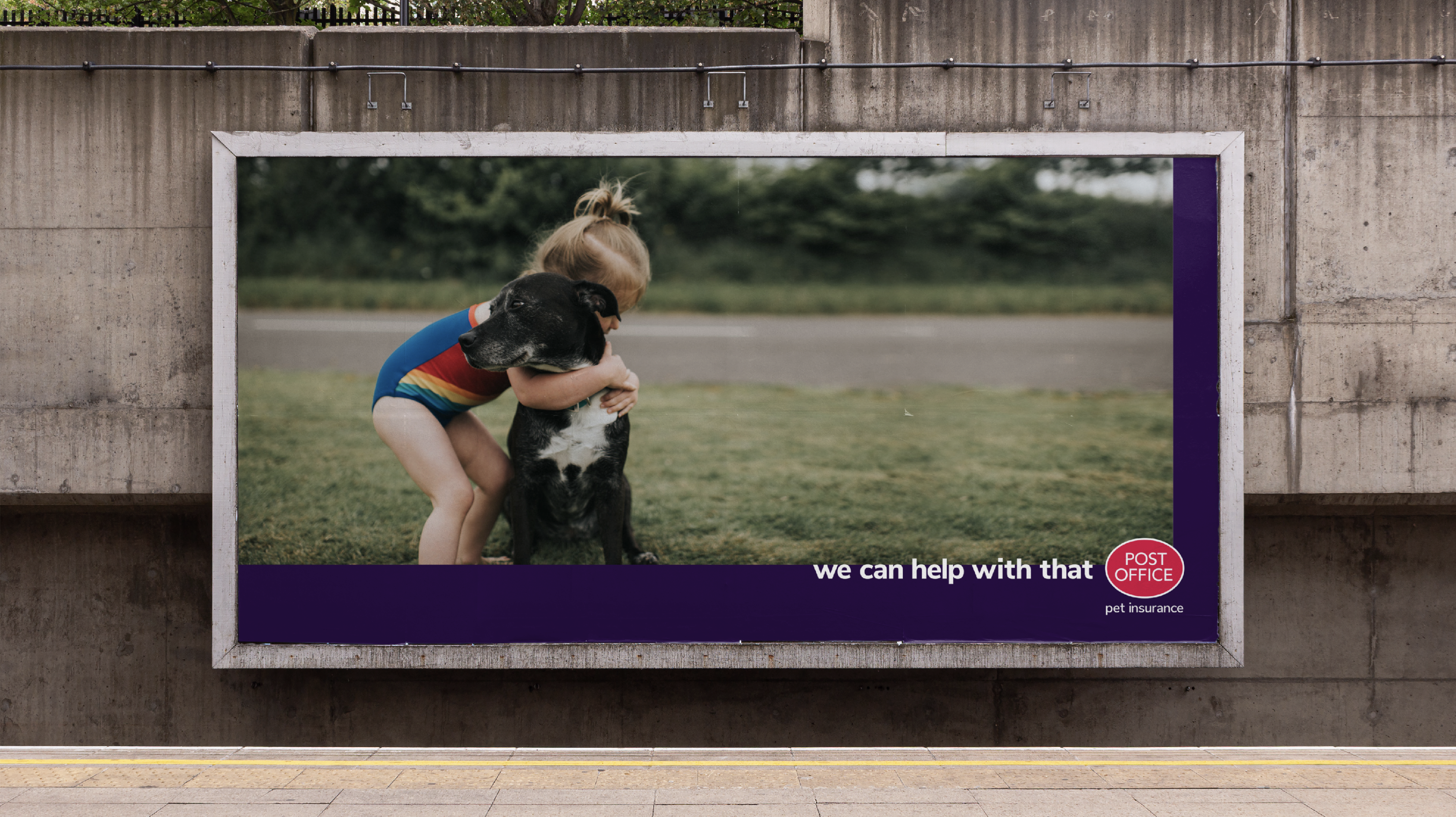
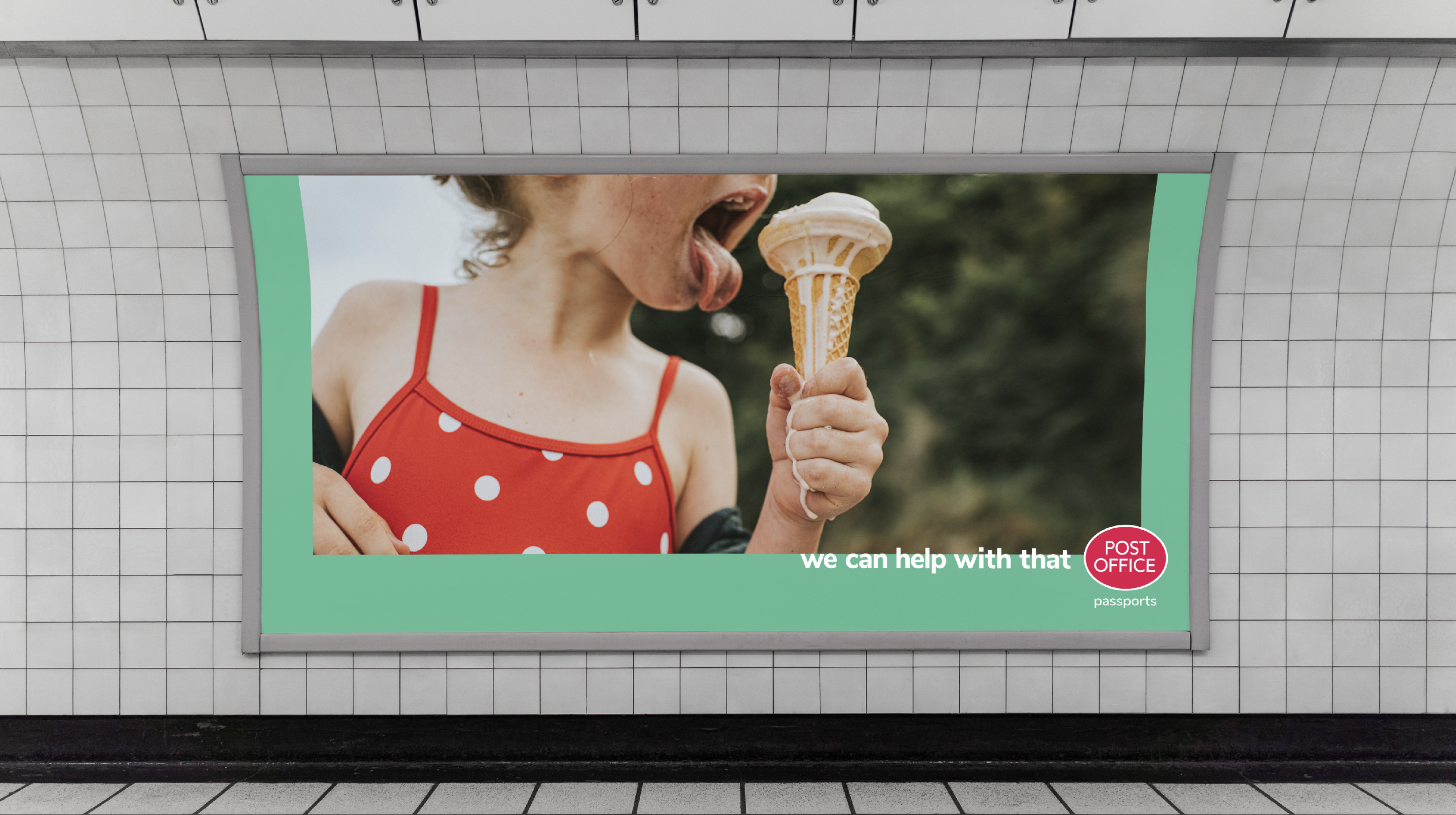
Strong and striking imagery to show the tapestry of Britain, short punchy headlines, a bold new colour pallette and a simple graphic language to modernise the brand.
What started as a proactive piece of work to show how we could push the PO’s look and feel was rolled out across the full brand.
Rolled
Strong and striking imagery to show the tapestry of Britain, short punchy headlines, a bold new colour pallette and a simple graphic language to modernise the brand.
What started as a proactive piece of work to show how we could push the PO’s look and feel was rolled out across the full brand.
Rolled